I’ve occasionally seen book dealers state that James Branch Cabell’s signatures in limited editions of his works – such as the collected Storisende edition – are not genuine hand-written signatures but instead are facsimiles or are done by auto-pen. I’ve also seen it claimed that the Storisende signatures are done in pencil.
Not having my chemistry lab or electron microscope to hand I cannot speak to the last claim, although I must say I have never seen a smudged or pencilly-indistinct example. But I think the claim that Cabell’s Storisende signatures (and by implication his other limited edition signatures) are mere facsimiles can be more or less disproved.
The facsimile claim is not all that surprising. Cabell’s signatures are small and almost robotically regular, and at a glance might seem to be identical. But this was simply the way he wrote – not just signatures, but notes, letters, manuscripts and, one assumes, shopping lists. To add to the confusion, facsimiles of his signature were occasionally used in Cabell-related publications -- for instance, in Hugh Walpole’s The Art of James Branch Cabell (1920) and in the trade issue of Guy Holt’s Cabell bibliography (1924).
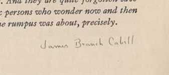
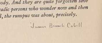
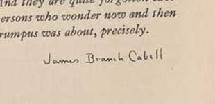
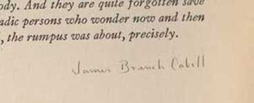
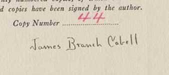
But not in the Storisende. Below are images of Cabell’s signature from the end of the Author’s Note in four different Storisende copies of The High Place, numbers 74, 82, 475 and 556. A close examination should satisfy anyone that these are four distinct signatures. Look at the C in Cabell – from signature to signature its shape varies slightly, its distance from the a varies, its upper extension ‘points’ at different spots on the a. Look at the B in Branch – in its upper left corner the way the vertical meets the horizontal varies from signature to signature. Look at the two Ls at the end of Cabell – see how they are not perfectly parallel but on no. 74 they are slightly farther apart at the top and on no. 556 they are slightly farther apart at the bottom? And this is just a sampling of what is fairly obvious to my untrained eye.
James Branch Cabell’s signature in four copies of The High Place (Storisende Edition).
Left to right: Copy No. 74, Copy No. 82, Copy No. 475, Copy No. 556.
If McBride & Co, Cabell’s publisher, was going to save time and effort by using facsimiles, surely they would have used the same one for all volumes? Or at least the same for all copies of a single title, such as The High Place? (Though I haven’t reproduced it here, I’ve also compared the signature from The Line of Love no. 556 with The High Place from the same set and they also differ.) Instead it appears that Cabell signed by hand at least 28,620 Author’s Notes in the Storisende edition. Indeed, we have him referring (in a private letter -- that is, not for publicity purposes) to doing just that. The last three volumes of the Storisende edition were issued in 1930, and on January 18 of that year Cabell wrote to his friend Ellen Glasgow concerning the production of authorial prefaces for her collected edition, after which he remarked of his own signed prefaces, “Meanwhile I return to my labors, with, heaven be praised, now only some 1,700 signatures to be done in order to complete the entire job.” (The Letters of James Branch Cabell, ed. Edward Wagenknecht (1975), p.166.). [I seem to recall another reference to his three-year signing marathon in which he complains of eye-strain and consoles himself with whisky, but I can’t put my finger on it just now.]
Another interesting aspect of Cabell’s Storisende signatures is that the Manuel labor involved seems to have led him to simplify his signature. Below is an image from the 1921 limited edition of Taboo. There are several marked differences from his Storisende signatures: the capital J has a cross-bar at the top and a fillip at the bottom, and the capital C has a fillip or serif at the top.
Until sometime in 1927 this is what Cabell's signatures looked like. I’ve seen dozens of his signatures, from a letter written in January 1927 going back to before 1910 in signed editions, in inscriptions, and in personal letters, and they have all featured these curlicue elaborations. Then came the large-paper limited edition of Something About Eve in September 1927, followed closely by the initial volumes of the Storisende. I’ve also seen dozens of Cabell’s post-1927 signatures in signed editions, in inscriptions, and in personal letters, and with one exception those follow the Storisende template—no cross-bar, no fillips. His signatures can, with rare exceptions, be divided into two periods – pre- and post-Storisende. (The exception I’ve seen is a signature in the pre-1927 style on a letter written in 1931 to his bibliographer I. R. Brussel. There are no doubt other exceptions, but the general observation holds.)